- 5 New Excel Features in Office 365 You Might Have Missed
 Excel isn’t the same spreadsheet program you used a few years ago – Microsoft 365 subscribers get a constant stream of updates that make Excel… Read more: 5 New Excel Features in Office 365 You Might Have Missed
 - Power BI vs. Tableau vs. Excel
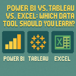 Power BI vs. Tableau vs. Excel: Which Data Tool Should You Learn? At STL Training, we often hear from professionals looking to sharpen their analytics… Read more: Power BI vs. Tableau vs. Excel
 - Preparing Your Team for Microsoft Copilot
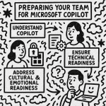 Preparing Your Team for Microsoft Copilot: A Manager’s Guide Microsoft Copilot is changing the way we work — and for managers, that means preparing your… Read more: Preparing Your Team for Microsoft Copilot
 - How to Thrive in Your First Leadership Role
 From Colleague to Manager: How to Thrive in Your First Leadership Role Stepping into your first management role is a milestone worth celebrating. But when… Read more: How to Thrive in Your First Leadership Role
 - What Can Microsoft Copilot Do for Your Business?
 In today’s fast-paced business environment, where efficiency is paramount, Microsoft Copilot has emerged as a valuable tool for many organisations. Integrated seamlessly into Microsoft 365… Read more: What Can Microsoft Copilot Do for Your Business?
 - Demystifying Microsoft 365 Copilot: What You Need to KnowWorking in business today means keeping up with demands that never seem to slow down. What if there was a way to finish reports faster,… Read more: Demystifying Microsoft 365 Copilot: What You Need to Know
- Unleashing Creativity and Efficiency with CopilotIn today’s fast-paced business world, the ability to think creatively and work efficiently is more important than ever. Enter Copilot, an AI-powered assistant designed to… Read more: Unleashing Creativity and Efficiency with Copilot
- What is new in the March 2024 version of Power BI?We are excited by the March 2024 update for Power BI. This edition brings forth an array of new features and improvements, meticulously curated to… Read more: What is new in the March 2024 version of Power BI?