Imagine speedometer-like dials instantly conveying performance against targets – that’s the power of gauges!
This blog post dives into common gauge limitations and equips you with solutions to create impactful visuals.
Gauge Advantages: Why They Shine
Clarity at a Glance: Gauges efficiently showcase a single value with a range, making data trends and comparisons readily apparent.
Visual Harmony: Combine gauges with other visuals like charts and tables for a well-rounded data story.
KPI Champion: Gauges excel at displaying progress towards goals (KPIs), allowing you to monitor performance with ease.
Conquering Gauge Challenges: Solutions for Common Issues
While powerful, gauges can present a few hurdles. Let’s explore two common scenarios and their solutions:
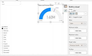
Challenge 1: Target Line Disappearing Act
The default gauge sets the “maximum value” (target) to double the current value. This can cause the target line to vanish if the previous month’s sales (target) are more than twice the current month’s sales.
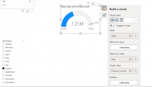
Solution: Create a custom measure to dynamically adjust the maximum value. Here’s the logic:
Check if the target is more than double the current value.
If yes, set the maximum value to the target + a small buffer (e.g., 200,000) to avoid the target line merging with the max line.
If no, set the maximum value to double the current value (default behaviour).
Challenge 2: Gauge Loses Focus When Filtered
Imagine using a gauge to compare regional sales against an overall average. When you filter by region, the gauge might only reflect that region’s performance, losing sight of the overall average.
Solution: Utilise the ALL function within a CALCULATE function to tell Power BI to ignore filtering for specific measures. This ensures the overall average remains displayed regardless of region filters.
Here’s how to adjust your measures:
Overall Average (Unaffected by Region Filters):
Average all regions = CALCULATE(DIVIDE([Sales],DISTINCTCOUNT(Customers[Region]),0),ALL(Customers[Region]))
Maximum Value (Unaffected by Region Filters):
Sales all regions = CALCULATE([Sales],all(Customers[Region]))
Conclusion: Mastering the Gauge for Impactful Data Communication
By understanding its strengths and overcoming limitations, you can transform the Power BI Gauge visual into a powerful tool for clear and impactful data communication. Remember, gauges excel at conveying key metrics and trends, making them a valuable asset for data analysis and reporting.
Welcome to the world of data visualisation and analysis with Power BI! In this blog, we’ll dive into the heart of Power BI’s analytical capabilities: DAX measures.
DAX, or Data Analysis eXpressions, is a powerful formula language that enables users to define custom calculations in Power BI reports. Whether you’re a seasoned data analyst or just starting out, understanding DAX measures is key to unlocking insightful business intelligence.
So, let’s explore some of the most popular measures, array functions, and time-intelligence functions, and see how they can transform raw data into meaningful insights.
Calculate Measure
Some often-used Power BI DAX measures include:
SUM: calculates the sum of a selected column of data
AVERAGE: calculates the average of a selected column of data
COUNT: counts the number of rows in a selected column of data
MIN/MAX: calculates the minimum or maximum value in a selected column of data
DISTINCTCOUNT: counts the number of unique values in a selected column of data
CALCULATE: modifies the context within which a DAX formula is evaluated
FILTER: filters a table based on specific criteria
RANKX: ranks values in a selected column of data
YEAR/QUARTER/MONTH: extracts various time periods from a date column in a table
DAX measures allow users to perform complex calculations and analysis on their data quickly and effectively, providing valuable insights into trends and patterns in their data.
Array functions
Many measures in Power BI desktop need to be array measure, because of the data model structure in a Power BI model.
One of the powerful features in DAX is this ability to create array measures, which are measures that return an array of values instead of a single value. This can also be complicated for users, who haven’t been working with data cubs.
Here are some examples of DAX array measures:
1. DISTINCTCOUNT function:
DISTINCTCOUNT returns the number of distinct values in a column or expression. When used in an array formula, it returns a list of distinct counts for each value in another column.
For example, the following DAX formula returns an array of distinct count values for the “Product” column:
= DISTINCTCOUNT(Products[Product])
2. FILTER function:
FILTER returns a table that meets certain criteria specified in the expression. When used in an array formula, it returns a list of filtered tables for each value in another column.
For example, the following DAX formula returns an array of filtered tables for each value in the “Category” column:
VALUES returns a table of unique values in a column or expression. When used in an array formula, it returns a list of unique values for each value in another column.
For example, the following DAX formula returns an array of unique values for each value in the “Category” column:
= VALUES(Products[Category])
4. SUMX function:
SUMX returns the sum of an expression for each row of a table. When used in an array formula, it returns a list of sum values for each value in another column.
For example, the following DAX formula returns an array of sum values for each value in the “Product” column:
= SUMX(Products, Products[Price])
Array measures are a powerful way to analyse data and gain insights from multiple dimensions at once. With DAX, you can build complex array formulas that can handle large amounts of data and answer specific business questions.
This formula groups sales by customer ID and calculates the sum of sales amount for each customer. Then, it takes the average of all the customer sales.
This formula calculates the growth rate of sales from the previous month. It uses the DIVIDE function to divide the total sales amount by the total sales amount from the previous month. Then, it subtracts 1 to get the growth rate percentage.
5. Running Total of Sales by Month:
CALCULATE(
SUM(Sales[Amount]),
FILTER(
ALL(Sales),
Sales[Date] <= MAX(Sales[Date])
)
)
This formula calculates the running total of sales by month. It uses the CALCULATE function to add up the sales amount for all dates that are less than or equal to the maximum date in the current filter context. The FILTER function is used to remove any filters on the date column that might interfere with the running total calculation.
Time-intelligence functions
DAX (Data Analysis Expressions) Time-intelligence functions allow users to analyse data over time, providing insights into key trends and patterns.
Some common DAX Time-intelligence functions include:
TOTALYTD: This function returns the total value of a given measure from the beginning of the year up to the selected date.
TOTALQTD: This function returns the total value of a given measure from the beginning of the quarter up to the selected date.
TOTALMTD: This function returns the total value of a given measure from the beginning of the month up to the selected date.
SAMEPERIODLASTYEAR: This function returns the total value of a given measure for the same period last year.
DATESYTD: This function generates a table with all the dates within the current year up to the selected date.
DATEQTD: This function generates a table with all the dates within the current quarter up to the selected date.
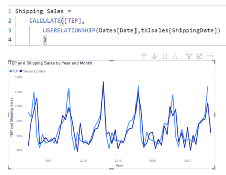
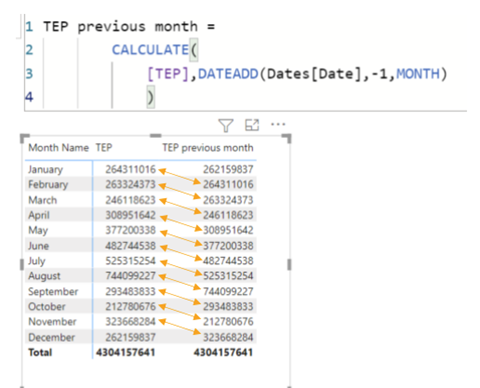
DATEADD: This function adds a specified number of units to a given date.
Example: DATEADD Returns a table that contains a column of dates, shifted either forward or backward in time by the specified number of intervals from the dates, in the current context.
Syntax: =DATEADD(<Dates>,<Number of intervals>,<Interval>)
where the <Interval> can either be Year, Month, Quarter or Day
These functions can be used in combination with other DAX functions to create more complex analyses and visualisations.
Conclusion
As we wrap up our exploration of DAX measures in Power BI, it’s clear that these tools are indispensable for any data professional. From calculating simple sums to performing complex time-based analyses, DAX measures empower us to make data-driven decisions with confidence.
We encourage you to experiment with the examples provided and discover the full potential of DAX in your own business scenarios. Remember, the power of data is at your fingertips, and with Power BI and DAX, there’s no limit to the insights you can uncover!