Today, I’m talking with Martin, one of STL‘s outstanding Power BI trainers, about the importance of Data Modelling. I’m asking Martin how I can maximise my data’s performance with data modelling in Power BI.
Hi Martin, thanks for taking the time to have a chat with me. My Power BI Reports often take ages to update when new data is added at source. I need to structure my data so that it takes up less memory and updates more quickly. I have a few questions for you:
What is a Data Model and why is it so useful?
Martin: A Data Model, in simple terms, is a system of datasets or tables with specific fields in common with each other. These are connected using something called ‘Relationships’. It is these relationships that help bring the disparate tables together as though they were a single entity. So why have a data model if you could just have one single file that contains all the data? The reason is that this single file (or flat file) uses up more memory and slows down performance because data is needlessly duplicated across multiple rows. However, a data model reduces the amount of duplication and will, in practice, help you become more productive.
That doesn’t sound too hard. How does it work?
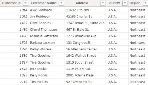
Martin: Let’s say you had Customer data relating to their contact and order details. In the table below is a ‘Customer’ table where Customer ID appears once. Each row contains a unique record of customer details.
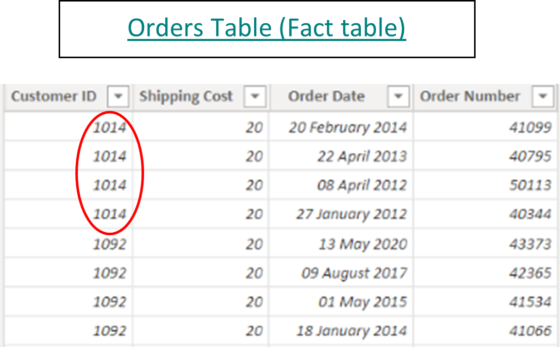
The 2nd table below contains many orders for each customer, so the Customer ID appears many times e.g., Customer ID 1014.
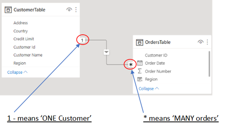
When these two tables are imported into Power BI desktop from Excel, the common field which is ‘Customer ID’ is used to create a ‘1 to Many’ relationship. This means that, for example, you can create a report visual to show a breakdown of Customer orders by Region even though the Order and Customer fields are in separate tables.
Without creating a data model, what is the alternative?
Martin: The standard practice would be to:
- Use the VLOOKUP formula in Excel to ‘look up’ each Customer ID in the Orders table
- Find a match in the Customers table
- Then return the corresponding ‘Region’ as a separate column back in the Orders table (see below)
- Once all the data is in a single table, create a pivot table to summarise ‘Orders per Region
Note that ‘Northeast’ is duplicated 4 times. If each customer placed an average of 1000 orders and there were 100 customers, then the customers’ region would be repeated by a huge amount (100,000 times more). This inevitably slows down the performance and affects productivity. In contrast, the data model in Power BI Desktop would only refer to the ‘Regional data’ 100 times – once for each customer in the Customer table – and is therefore more efficient and quicker in processing the data.
Any final thoughts, Martin?
Martin: Using data models in your Power BI reports can dramatically reduce the amount of duplication and therefore help to maximise your data’s performance.
To learn more about Data Modelling and how to apply it to your data, STL runs a 2-day Power BI Modelling, Visualisation and Publishing course. Please click on the link below for the course outline:
To see how data modelling can be applied, please click the following article:
Thanks so much, Martin, for explaining how to maximise data performance with Data Modelling in Power BI. I will explore this some more and start creating my own data models from now on!
