Microsoft has created some very interesting AI (Artificial Intelligence) visuals for Power BI. Power BI offers four AI visuals – Q&A, Key Influencers, Decomposition Tree, and Smart Narrative. This is Power BI AI Visuals Part 4 – Smart Narrative.
AI visuals are very useful. All four can provide your report with insight information from your data model. Without these, you need DAX measures to create your own visuals.

Smart Narrative
The Smart Narrative AI visual can explain your graphic by searching for key influencers in your data model.
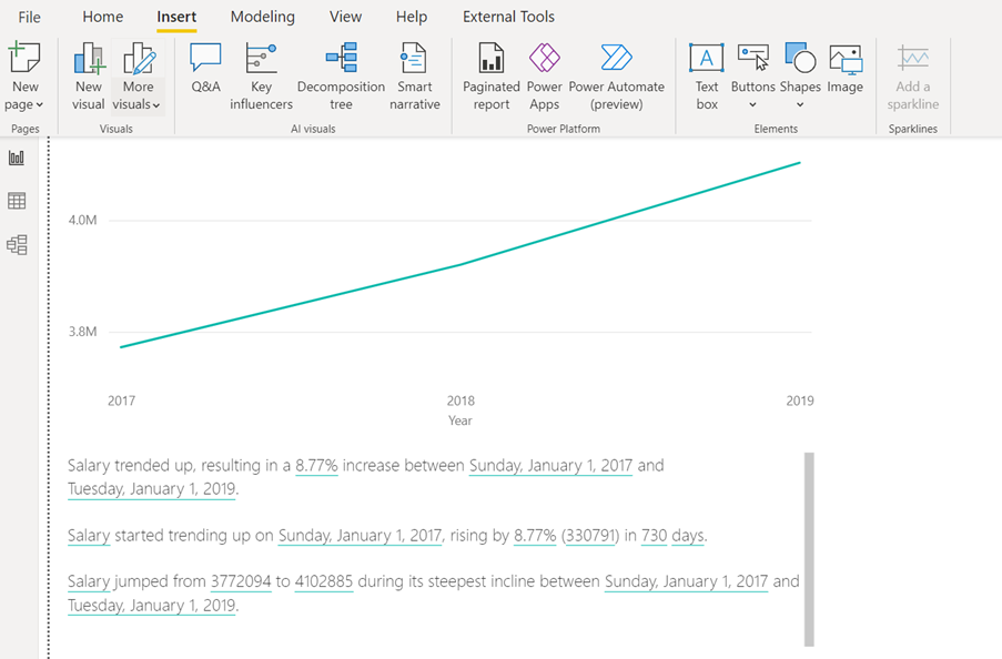
In the example below, you can see a simple line chart. The data model in this example is from HR data and the line chart show salaries for all employees over 3 years from 2017 to 2019. To get insights from the smart narrative visual, it needs to be selected. In this example, select the line chart, then click Smart Narrative on the Insert tab in the AI Visuals group. Power BI will then find interesting statistics and create a text box with these statistics. In the simple example below, below the line chart you can see the result of this analysis.
A More Interesting Example
In the HR data model used here, we measured the employees’ productivity and engagement scores. In the example below, we need to explain the correlation between engagement and productivity on a Power BI page.
Below you can see the visual for all departments and the text box created by Smart Narrative.
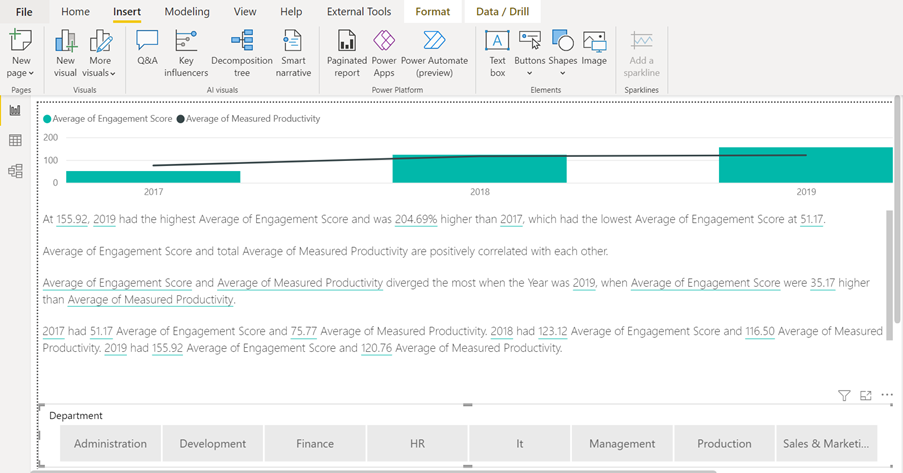
Above, you can see a slicer to filter by department at the bottom of the page. The Smart Narrative text will change if you filter the chart visual.
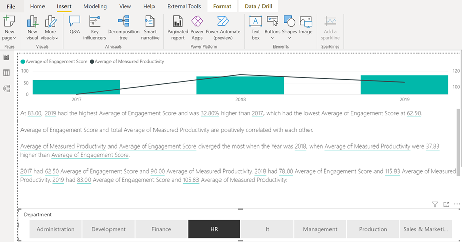
Below, the page is filtered to only show data from the HR department. In the example above, there was close positive correlation between engagement score and productivity. However, you will see in the example below that the trend is different in the HR department. The engagement is still positively correlated by the productivity over all 3 years, but the last year is negatively correlated. You can also see that the Smart Narrative tool now only looks at insight data about the HR department.
Conclusion
Before Smart Narrative was available in Power BI desktop, we had to create text boxes with static text to explain the visuals. Smart Narrative not only explains the visual but also gives the audience insight which takes the in-depth analysis to provide a number of DAX measures. Furthermore, it is dynamic. When the trends change over time, the text will update. As you saw in the examples above, the narrative will also change when the visuals get filtered.
This concludes Power BI AI Visuals Part 4 – Smart Narrative. If you would like to find out about the other AI visuals in Power BI, please follow STL on LinkedIn or visit our website.
STL has two Power BI courses which include AI visuals. Power BI Reporting and Power BI Modelling, Visualisation and Publishing.