Conditional Formatting is an amazing tool that allows you to track and monitor data more efficiently. It highlights information of interest. For many years, it has been the ‘go to’ tool in Excel, and now it is also available in Power BI desktop.

What is Conditional Formatting
Conditional Formatting is based on setting rules on certain data and if any of this data meets this rule then it will change its appearance in some way e.g. display an icon or change colour (see below)
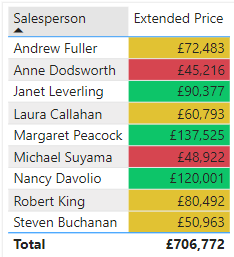
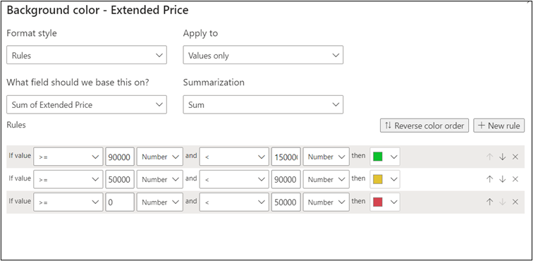
In this example, there are 3 separate rules all set according to specific bands or ranges of numbers. If a number falls into a specific band, then it will change to the appropriate colour. The world of finance has coined the term ‘RAG’ status – or Red, Amber, Green. Each colour represents low, medium, and high numbers respectively. Whilst the Power BI desktop has many pre-set icons and colour ranges to help you to adopt this useful tracking system.
Why use Conditional Formatting
Power BI desktop is all about being able to analyse the latest data. Thanks to its powerful connections to the original data, Power BI can always display the most up-to-date data with Conditional Formatting. This makes it possible to see who or what is performing well/not so well in an instant. Simply by using the colours previously set. In a word, Conditional Formatting is ‘dynamic.’ Therefore it will always reflect the latest data if it happens to change at source level. This in itself will allow you to be more efficient in spotting key trends and performance indicators.
How to use Conditional Formatting
- In Power BI Desktop, import your data to analyse sales figures e.g. Extended Price for various items/products sold by a number of salespeople.
- In the Report View, create a Table visual to show the total Extended Price for each salesperson by dragging both Extended Price and Salesperson fields into the field well.
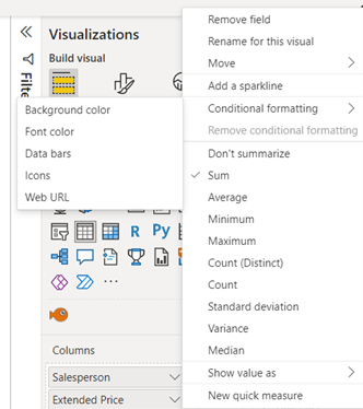
- Click on the Extended Price down arrow and select CONDITIONAL FORMATTING > BACKGROUND COLOUR.
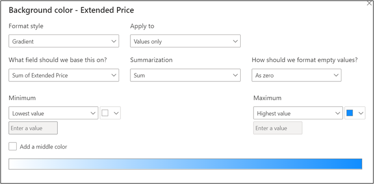
- Note the ‘Format Style’ is set to GRADIENT. For a simple colour distribution set your Maximum and Minimum colours – e.g. blue and white (see above) and click OK
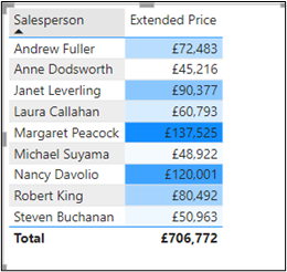
- The table below shows the figures from high to low using the blue to white gradient
This example is really quick. It is great for achieving a ‘rough and ready’ analysis. For a more precise method, you need to create rules to apply different colours to different bands just like the RAG status example shown at the beginning
- Create another table using the same visuals and select CONDITIONAL FORMATTING > BACKGROUND COLOURS as before
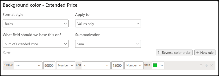
- Change ‘Format Style’ to RULES and enter values/colour as above. Click on the ‘add NEW RULE’ button
- Now add 2 more rules entering the following values/colours and click OK to apply the RAG colours to the visual
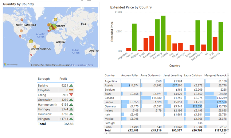
There are other ways to ‘tell your digital story’ through Conditional Formatting as seen below:
Conclusion
Conditional Formatting is a powerful tool that will help you become more efficient and productive in the process of tracking the most up-to-date performance figures .
If you’re interested, you can read more on Data Visualisation here.