Microsoft Power BI has introduced a plethora of new features that are designed to improve the user experience and help organizations improve their return on investment (ROI). These new features include everything from improved data modelling capabilities (new DAX functions) to new visualization tools and advanced analytics integrations.

In this blog post, now that we’ve had a bit of time to test them out and play around with them, we will take a closer look at some of the new features. In doing so, we will look at how they can help organizations get more value from their Power BI investments.
1. Smart Narratives -visual summary icon features
Smart Narratives is a new feature that automatically generates natural language descriptions of charts and graphs in Power BI reports. This feature is designed to help non-technical users understand the insights and trends represented in data visualizations. By providing easy-to-understand explanations of complex data, Smart Narratives helps organizations make more informed decisions based on data-driven insights. This can ultimately lead to better business outcomes and improved ROI.
Smart Narrative visual summary icon
In the February 2023 version, Microsoft has added an optional icon to the visual header that generates an on-demand summary of the visual contents. You can empower it in the format pane for individual visuals or add it to your custom theme file for the visual styles you choose.
Select the visual and in the Format pane under General options Header icon. you can turn on the Smart Narrative icon under Icons.

When your audience hover the visual, they will find the Smart Narrative icon above the visual, and if they click on the icon, Power BI will provide the information.
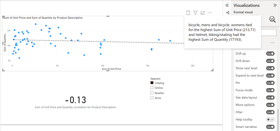
In this example Smart Narrative shows some sales stats.
2. Custom Themes features – Update your base theme in Power BI
Power BI’s Custom Themes features allow users to create customized themes that can be applied to all reports and dashboards. Custom Themes is an ideal feature for organizations that want to ensure their reports and dashboards are on-brand and aligned with their visual identity. By providing users with the ability to create custom themes, Power BI helps organizations save time and improve efficiency. Organizations can also ensure that By ensuring that reports and dashboards are on-brand. This will improve the user experience. Therefore, they will see increased adoption and improved ROI.
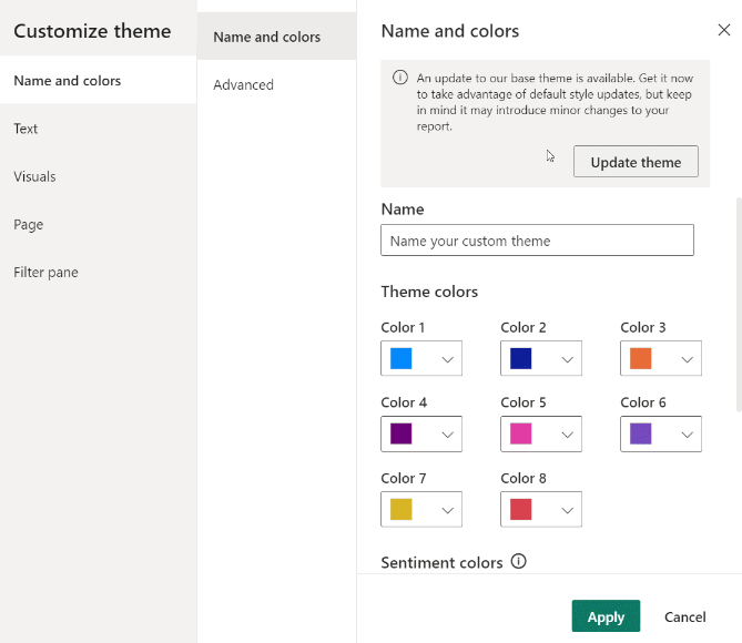
Update your base theme in Power BI
In the February 2023 version Microsoft has added an easy and efficient way to update your current theme.
Many changes to visuals and reports have been added, including new standard defaults for formatting settings. This has been added as a part of a new base theme so it will not to interfere with existing reports.
When you open the Custom Theme dialog box, you will find the Update Theme option top right.
3. New DAX functions: LINEST and LINESTX feature
In the February 2023 version Microsoft are introducing two new statistical DAX functions: LINEST and LINESTX. These two functions make linear regression, leveraging the Least Squares method, to calculate a linear line that find the best fits for given factual data sets and return a table describing that line. These functions are especially useful in forecasting unknown values (Y) given known values (X).
Both functions can return slopes (the gradient), intercepts, standard errors, and the coefficient of determination. The functions return the equation for a linear line: Y = Slope1 * X1 + Slope2 * X2 + …+ Intercept.
The difference between LINEST and LINESTX is that LINEST expects columns of known X and Y values to be given. Whereas LINESTX (array function) requires a table and expressions to be calculated for each row of the table to achieve the X and Y values.
-
New Visualization Tools
Power BI’s new visualization tools enable users to represent data in more effective and compelling ways. These new visualization tools include Visualizations (third party visuals) Balance Sheet Visual by K Team Solutions, Gantt Chart by MAQ Software, Supermetrics Charts – Tile grid map, Tachometer, valQ – Collaborate, Zebra BI Charts, Beeswarm Chart, Cumulative by sio2Graphs, DoubleYaxis, swUniaxialScatterPlot, swBoxPlot, sw3D_StackedBarDiagram, PictureThis, Milestone Trend Analysis Chart by Nova Silva. You can find all these new third party visuals in AppSource.
Milestone Trend Analysis Chart has been updated. Microsoft have enjoyed a lot of positive feedback about this visual.
Milestone Trend Analysis (MTA) is a straightforward way to identify deadline trends proactively, and will raise the deadline understanding of all project participants and stakeholders.
Key revises in the Milestone Trend Analysis Chart are:
Easy navigation through time by Zoom slider support
New different marker icons
Direct labelling to replace legend
Details Tooltip to include overlapping markers
Microsoft are providing users with more visualization options. In doing so, Power BI helps organizations create reports and dashboards that are more engaging and informative. This can ultimately lead to improved decision-making and increased ROI.
In conclusion, Microsoft have designed several new features to improve the user experience. Organisations can improve their ROI by implementing them. New smart Narratives options, Custom Themes improvement, and new DAX functions help organizations save time and improve efficiency.