Why is Power BI taking over the world? Why are so many organisations currently implementing Power BI? Power BI is the most efficient tool to manage business intelligence in a world where the data sets are getting bigger and bigger. The importance of making quick and correct decisions is a key factor in running a successful business. Microsoft constantly improves Power BI. In this blog, we will show you how to create Field Parameters in Power BI.
The ‘Creating a Field Parameter’ tool can create a dynamic visual in few seconds, increasing your productivity. This gives the audience interactive options to choose which information they want the visual to display. In the past, we needed to write DAX expressions to achieve this.
In the following example you will see how this is done by creating a table and writing DAX expressions. DAX (Data Analysis epression) is essential to all Power BI reporting and data modelling developers. STL has a one day DAX course for all who need to write DAX in Power BI desktop.
Field Parameters done with DAX
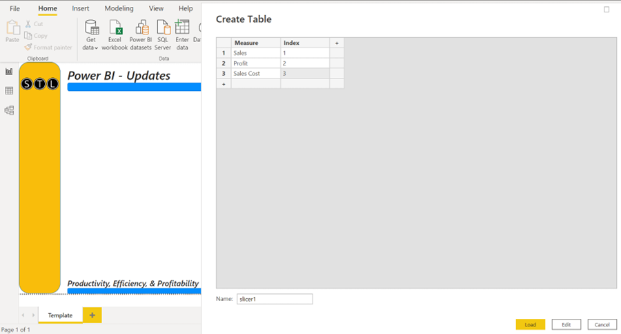
Firstly, you need to create a table. Click Enter Data from the Home tab. In the first column, enter the names of the measures you want to be able to select from a slicer. The slicer will change the visual. Add a second column to create an index (see image below). Name the table at the bottom of this dialog box.
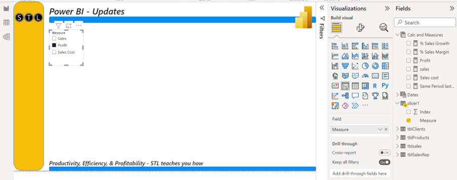
Create a Slicer visual and add the Measure column from the created table to the field (see image below).
Now it is time to run the DAX measure. You can use the logical Switch function to return the measure selected from the slicer.
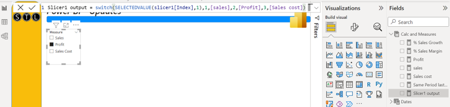
The logic in the DAX measure is in the image below. The Switch function will test the value selected from the slicer. If the index value is 1 (Sales), it returns the Sales measure, if the index value is 2 (Profit) it returns the Profit measure. Index value 3 (Sales Cost) returns the Sales Cost measure.
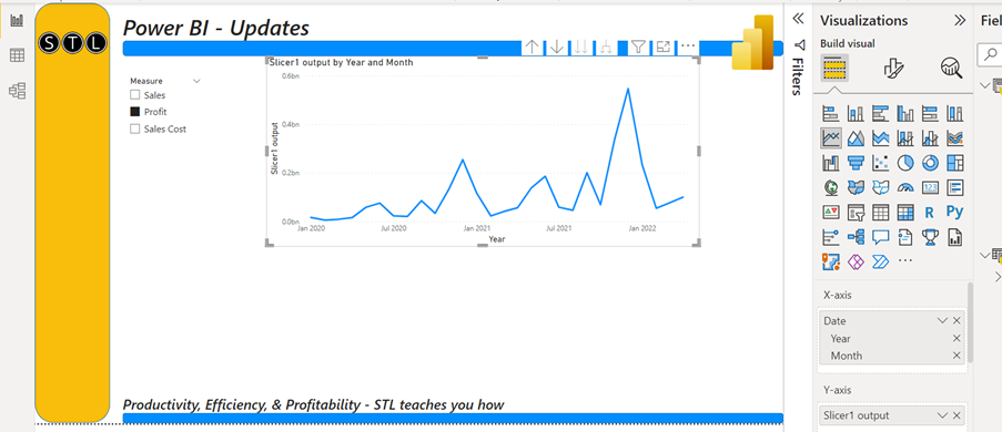
Creating a visual to show the selected measure from the slicer
The visual (a line chart here) header will not show the selected measure from the slicer, but you can create one by writing another DAX measure.
Visual Name=SelectedValue(slicer1[measure],”Sales”)
This measure will get the selected value (measure name) from the slicer. If nothing is selected from the slicer, it will return the alternate result ‘Sales’ by default.
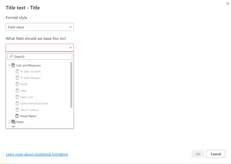
Now you can use the measure to create a dynamic title for the visual. With the visual selected, you will find the title under the formatting options. Next to the title there is an fx button. When you press the fx button, you can use the measure to create a dynamic title.
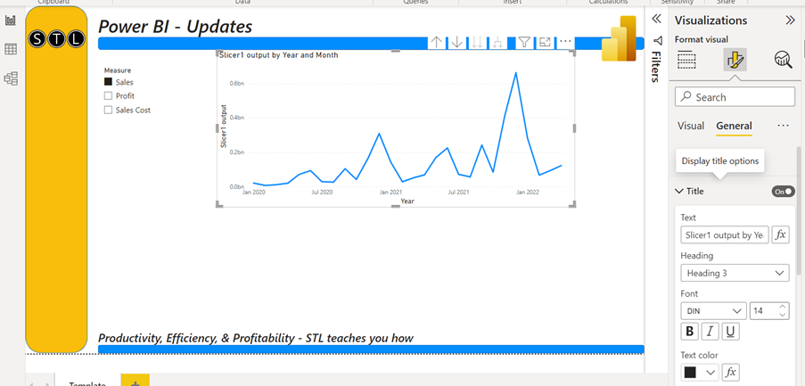
Clicking fx will open the dialog box where you can select the measure which creates the dynamic visual header.
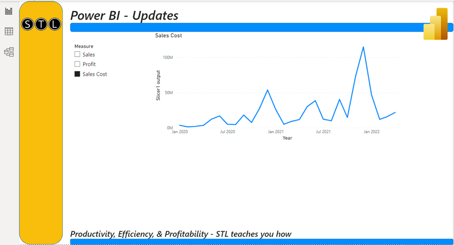
The visual will now display the selected value from the slicer as a title!
Now to do something similar with the new tool – Creating a field parameter
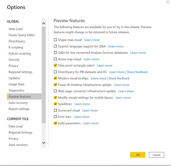
The new tool we got in the May version of Power BI is a preview feature but will soon be a permanent tool.
Firstly, you will have to enable the tool called Field parameters:
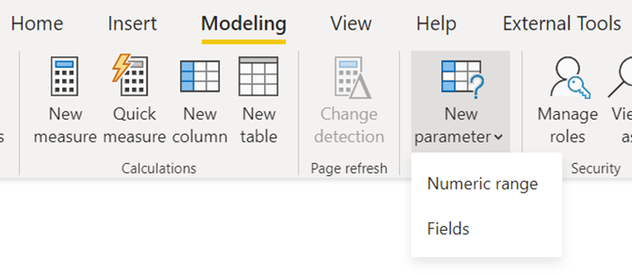
Then, to create a new field parameter, you will need to navigate to Modeling > New parameter > Fields
To build the parameter, you need to provide a name for the parameter and select the fields you want to use. You can select different dimensions (fields from different tables across your data model) or different measures. The example below starts with different dimensions.
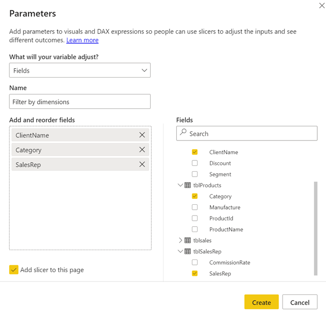
From a slicer, select the fields you would like to filter on the visual. If you keep the tick in the bottom left corner, you will create a slicer with the dimensions.
The Field parameters feature will write DAX code to make the slicer and the data model understand what you want.
The DAX code for this example
Filter by dimensions = {
(“ClientName”, NAMEOF(‘tblClients'[ClientName]), 0),
(“Category”, NAMEOF(‘tblProducts'[Category]), 1),
(“SalesRep”, NAMEOF(‘tblSalesRep'[SalesRep]), 2)
}
The slicer will display the field names from your data model. If you want more user-friendly names from the slicer, you can amend the code.
Filter by dimensions = {
(“Client”, NAMEOF(‘tblClients'[ClientName]), 0),
(“Product Category”, NAMEOF(‘tblProducts'[Category]), 1),
(“Sales Rep”, NAMEOF(‘tblSalesRep'[SalesRep]), 2)
}
Adding or removing fields after creating the Field Parameters slicer
Filter by dimensions = {
(“Sales Rep”, NAMEOF(‘tblSalesRep’[SalesRep]), 0),
(“Product Category”, NAMEOF(‘tblProducts’[Category]), 1),
(“Client”, NAMEOF(‘tblClients’[ClientName]), 2),
(“Month”,NAMEOF(Dates[Month Number]),3)
}
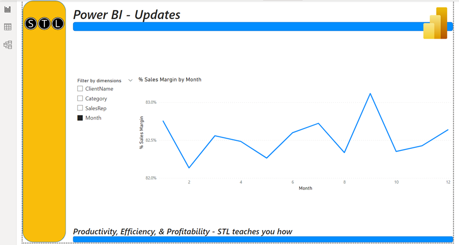
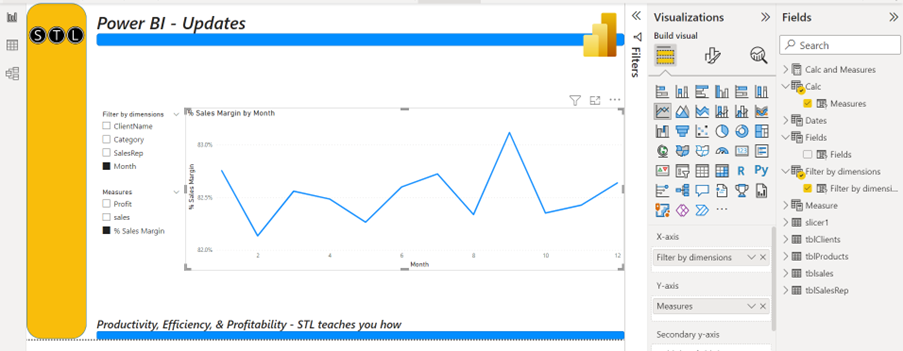
In the example above, the Month Number field has been added by amending the DAX code. The slicer will now give the report’s audience the option to break down the visual by month.
Using the Field Parameter tool to break down visuals by measures
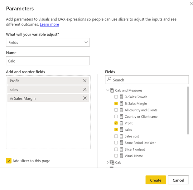
You can mix and match different measures and dimensions within the same parameter. For example, you can use this feature to create a dynamic table where the columns can be either measures or dimensions.
As shown below, when you use the new Field Parameter feature, the title of the visual will display the selected fields from the slicer. Again, you will not have to write a DAX measure to do this. It can be this easy to create Field Parameters in Power BI.
Using a field parameter to control visual properties
Once you have created the field parameters, you can use them to control the measures or dimensions used in a visual.
You can use the parameter in the field drop zones for a visual.
Conclusion
The new Field Parameter feature is an efficient way of creating very dynamic visuals. It reduces the number of pages needed for the report to give the audience proper business intelligence. This is, then, how to create Field Parameters in Power BI for your reports.


