In life as in business, we always strive to find the easiest ways of getting things done. Sometimes, however, the simplest methods involve cutting corners, obtaining short-term results but long-term headaches.
One of a long line of Excel features, the PivotTable is the best way to break your information down into more manageable chunks. In this post we’ll outline simple uses for the PivotTable along with a few tips to help you get the most out of your data.

Uses for PivotTables
Anyone with a need to break down large data sets will find a use for the PivotTable. Sales managers, IT professionals, financiers and even marketers can save time and the get most from their information with this popular Excel feature.
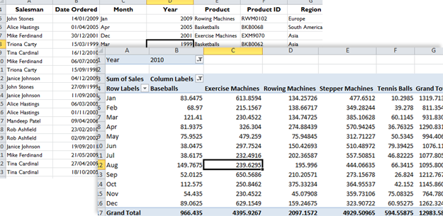
A fantastic tool for summarising your data, the PivotTable has the ability to find hidden trends or relationships between data. Ok, so they’re not really hidden, but they may as well be surrounded by all that information. Sales managers rejoice: these complex tables can outline sales performance of team members over specified time periods, even down to products sold and of course much more.
We empathise that the PivotTable has an off-putting name, but in truth, they are really easy to create and don’t even require a single formula to be written. To get started, just click any cell on your Spreadsheet and select PivotTable in the top navigation bar. Follow the prompts, tick a few boxes and complex tables will be created in front of your eyes.
As we touched on earlier, data can be easily transported, helping you to recognise trends within trends and look at your data more laterally. Again, for sales managers, one minute you’ll be able to see which team member has sold more coal to Newcastle in the past month, then you’ll be able to switch a few variables and see the trend of all products sold to Newcastle over the past few months.
Time saved is one of the major selling points for the PivotTable. These easy to create, complex tables become a powerhouse reference point for your every analysis requirements. From these tables, you’ll be able to create graphs and charts to better visualise your information. Ideal for presenting to colleagues and clients, you’ll look like a pro with just a few clicks of your mouse.
PivotTable Tips
One benefit of grouping your data is that you can extract a subset of the grouped data onto a new worksheet. It’s really easy to do this too, just locate the group and double click in the total cell containing the data you’re interested in. Then all of the data that contributed to that total will be extracted onto a new worksheet.
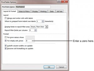
Replace blanks cells with zeroes. When the PivotTable doesn’t have data for part of a row, you’ll get blank cells. It’s easy to get around this by right clicking any cell in the PivotTable and choosing options. In the layout and format tab in the format section, type 0 next to the field labelled “for empty cells show“.
Automatic updates mean that as soon as you change data in your original Spreadsheet, all you need to do is hit the refresh button and your PivotTable data will be bought up to date. Saving you time having to create a new table each time, Excel intuitively recalculates your figures. The larger the company or those with collaborative documents, the more useful this feature becomes. Imagine how many new PivotTables would need to be created if sales figures were updated daily.
Excel has some pretty good table styles and customisation options that help your data stand out and make it clearer to digest, not to mention brightening up your Spreadsheet. Change the colour and layout of your table using pre-set templates found in the top navigation bar.
Change the PivotTable summary function by right clicking inside the table and selecting “summarise data by” option. This allows you to look at the same data at a different angle. Quickly creating dynamic tables allows you to find those trends and even summarise them with a chart or graph for better reporting.
Sort your data by timescales quickly. Right click a date in the row field to group by months, years or quarters. Again this is a useful feature for measuring sales revenue and data change over time.
By employing these hints and tips, you’ll be able to save time and effort in reporting. What’s your favourite tip for helping you get the most out of your PivotTable?
Want to become an Excel expert? Attend one of Best STL’s training courses available London and UK wide.


