The Analytics Pane in Power BI desktop is an amazing tool. You can use it to create a variety of different analytical lines inside your report visuals to highlight trends, target lines and forecasting.

This blog will explain how to create these analytical lines and show how useful they are in gaining insights into your data
Why use Analytics?
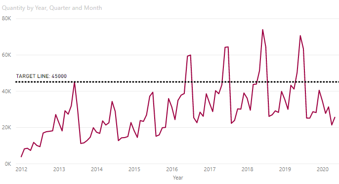
A report visual is great at representing key summary information such as the quantity of products sold every month. But what if you wanted to check how well your sales were meeting targets over time? You could manually look at each data point on a line chart, for example, but a more efficient solution would be to create a customised ‘target line’ within your line chart. This would instantly provide a visual which displays performance vs. target over a period of time. You will therefore become more efficient as you analyse the data. Below is an example:
How to get started
- Create a line chart based on a value field over time e.g. ‘Quantity’ by ‘Order Date’
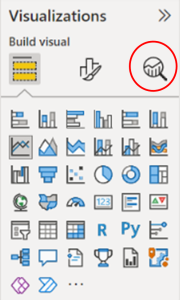
- With the chart selected, click on the ANALYTICS icon in the visualisation pane (see below)
- Expand the ‘Y-axis Constant Line’ section and click on ‘+ Add Line’
- Double click where it says ‘Y-axis Constant Line’ in the field and type TARGET LINE
- Expand the ‘Line’ section to show the options below:
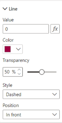
- Set the following details to your line:
- VALUE to 45000
- COLOUR to Black, for example
- TRANSPARENCY to 0%
- STYLE to ‘Dotted’
- Collapse the ‘Line’ section and turn on ‘Data label’ to reveal the expanded Data Label section:
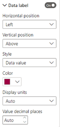
- Set the following label details to your line:
- STYLE to ‘Both’ i.e. both ‘Data Value’ and ‘Name’
- COLOUR to Black, for example
- DISPLAY UNITS to ‘Thousands’
- DECIMAL PLACES to 0
Other Analytical Lines
Notice in addition to the ‘Y-axis Constant Line,’ there are many other analytical lines you can apply to your visual some of which are described below:
- TREND LINE: turn on to show an upwards/downwards trend – especially useful for analysing performance data over time
- MIN LINE: click on ‘+ add line’ to show the lowest data point on a line chart – really helpful to identify the ‘bottom line’ of any business
- FORECAST LINE: turn on to show a ‘projected’ line appearing after the last data point. This line can be set over an extended time period of your choice – great for any future business planning
Finally, the analytical lines are only available in specific visuals. They are:
- LINE CHART
- COLUMN CHART
- BAR CHART
Conclusion
Trends, targets, and forecasting are one of many other analytical lines that can really enable you to track and monitor your performance data more efficiently. Using the Analytics pane in Power BI will definitely help to achieve this goal. This will enable you to work on your business’s profitability gains.