Microsoft has created interesting and engaging AI (Artificial Intelligence) visuals for Power BI. The desktop app offers four AI visuals – Q&A, Key Influencers, Decomposition Tree, and Smart Narrative. This is Power BI AI Visuals Part 3 – Decomposition Tree, the third in a series which looks at all four AI visuals.
AI visuals are extremely useful. All four visuals can provide your report with insights and information from your data model, without which you will have to do DAX measures to create your own visuals.

The Decomposition Tree visual
The Decomposition Tree visual in Power BI Desktop can let you visualize data across multiple tables and columns from your data model’s multiple dimensions. It automatically combines data and supports drilling down into multiple dimensions in any order. This tool is beneficial for ad hoc evaluation and managing root cause analysis.
In the example below, we used the Decomposition Tree visual to explore the employees’ productivity score. Productivity is measured frequently in the company, and we are using the visual to explain the score on many dimensions of the data model.
The Process
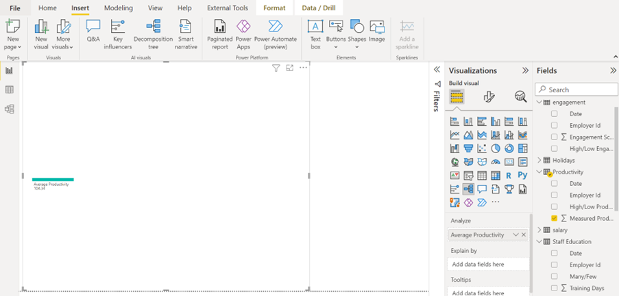
To create a decomposition tree visual, click Decomposition Tree on the Insert tab in the AI Visuals group. Then add the column you would like to investigate to the Analyse box for the visual. Here, you can drag the productivity score to the Analyse box and click on the down arrow in the box. This changes the calculation from Sum to Average.
Below you can see the start of the decomposition tree.
To investigate the score by department, we added the department column to the Explain By box. Have a look at the result of this action below.
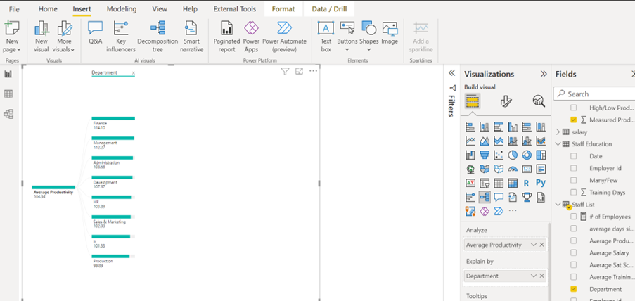
Now the Decomposition Tree visual has broken down the average productivity score by department.
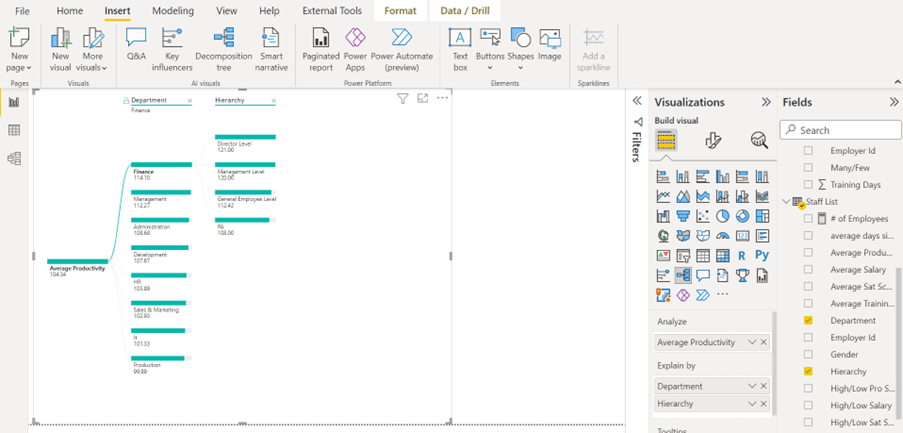
Below, we added the hierarchy dimension to the Explain By field. As you can see, it explains the productivity score by the department with the highest score. In this example, it is the finance department.
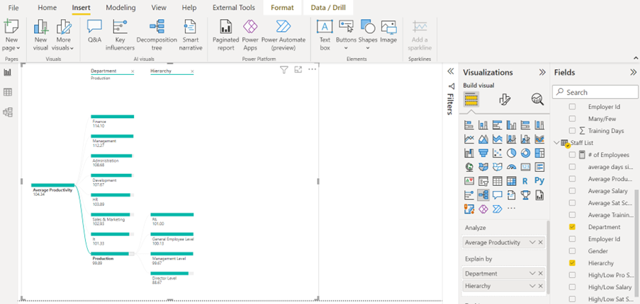
The audience can, however, interact with the graphic to investigate the other departments. To do this, simply click on a different department in the Decomposition Tree visual. Below, we selected the production department.
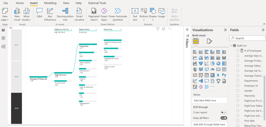
In the Decomposition Tree visual below, we are investigating the average number of sick days for the year 2019 (slicers can also filter the result in the Decomposition Tree visual). The result is broken down from highest to lowest score in an engagement survey this company does regularly to measure the employees’ job satisfaction. It may surprise you that employees with a high satisfaction score have a higher number of days of sickness.
The Decomposition Tree visual also shows the data broken down by Department and Hierarchy.
Conclusion
That concludes Power BI AI Visuals Part 3 – Decomposition Tree. This visual is a smart and efficient way to show and analyse multiple dimensions of your data model. You get in-depth knowledge from your data sets without having to use complex DAX measures.
This is part 3 of a series of four as mentioned at the top. If you would like to learn about the other AI visuals in Power BI, please follow STL on LinkedIn or visit our website.
STL has two Power BI courses which include AI visuals. Power BI Reporting and Power BI Modelling, Visualisation and Publishing.