Microsoft has created some interesting AI (Artificial Intelligence) visuals for Power BI. Power BI offers four AI visuals – Q&A, Key Influencers, Decomposition Tree, and Smart Narrative. This is Power BI AI Visuals Part 2 – Key Influencers.

AI visuals are extremely useful and all four can provide your report with insight information from your data model. Without these, you have to do DAX measures and create your own visuals.
Key Influencers visual
We used the same HR data model in the entire four-part series ‘Artificial Intelligence Visuals in Power BI Desktop’. In this blog post, we explain the Key Influencers visual. The HR data model measures the employees’ engagement score, number of sick days, and the employees’ productivity.
The report needs to visualise the key influencers for high engagement, high productivity, and why someone has many sick days.
To do this, some decisions have to be made. You will have to define what a high engagement score is, what a high number of sick days is, and what a high productivity score is.
The Method
If you decide that more than 5 days a year is a high number of sick days, you will need a calculated column where you test the number of days an employee has been sick. The calculated column could look like this: High/Low # of days sick=If([Days of sickness]>5, “high”,”Low”). We need to use the same logic for engagement and productivity.
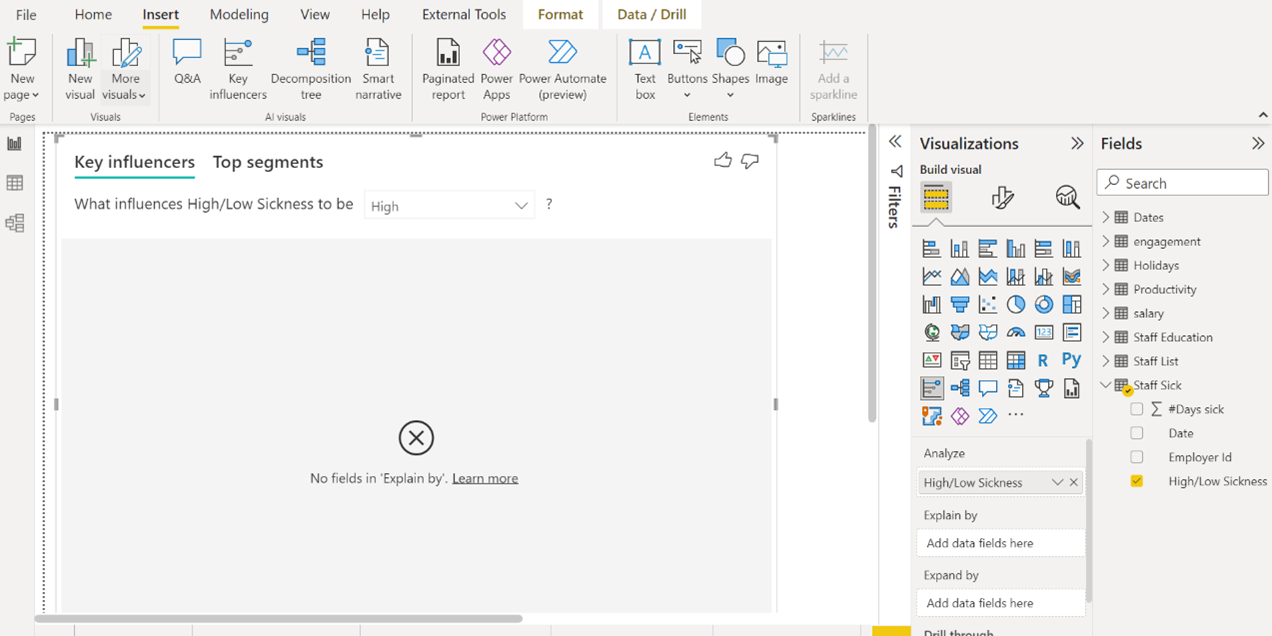
To get the Key Influencers visual, click Key Influencers on the Insert tab in the AI visuals group.
The Results
In the example below, we added the logical column to the Analyse field in the visual. At the top, we selected High, because the key influencers for many days of sickness need to be found.
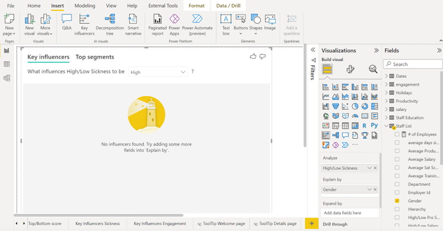
Below, we have dragged the information about the employees’ gender to Explain By. As you can see, the employees’ gender is not a key influencer for high level of sickness.
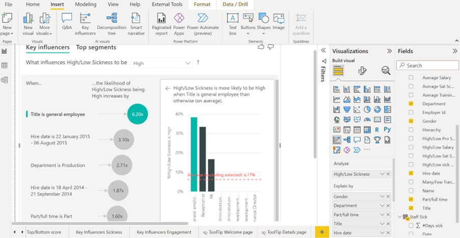
Below we have added four more columns to Explain By: Department, Part/Full Time, Title, and Hire Date. The Key Influencers visual now explains that the top influencer for a high number of days sick is Title. If you are a general employee in this company, the chances of having a high number of sick days are 6.2 times higher than other titles. The second largest influencer is an interesting one. It is Hire Date. All employees hired from the 22 January 2015 to 6 August 2015 have a 3.1 times greater chance to have more sick days.
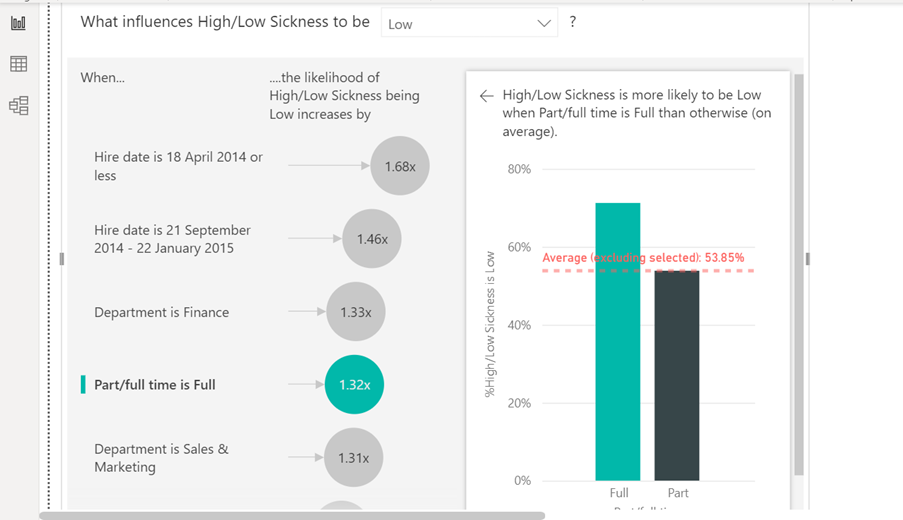
Below, High has been changed to Low to show the key influencers for a low number of sick days.
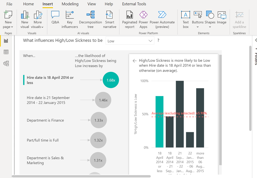
Within the Key Influencers visual, each key influencer can be visualised with a chart inside the visual. Above, you can see the chart for the top influencer. If you want a key influencer visualised in the chart, you just need to click on the circle with the number.
Below, we clicked on the circle with the number 1.32x to see the chart for Part/Full time
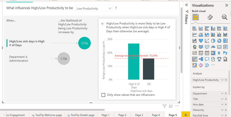
Below, you can see the visual showing the key influencers for Low productivity.
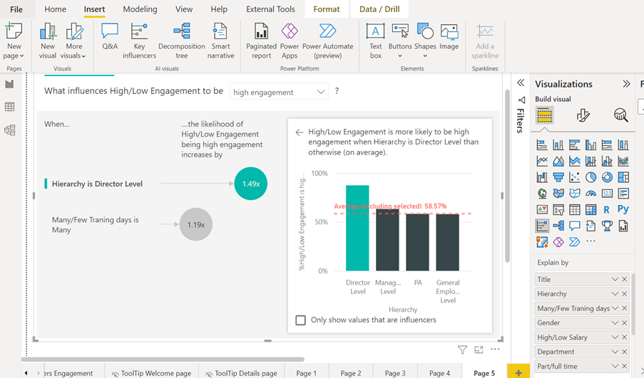
The last image shows the key influencers for a high engagement score.
Conclusion
The Key Influencers visual can give you very surprising insights from your data model. You can cross-analyse many data sources. This will give you an understanding of correlations and variables which influence your company’s results negatively and positively. Such insights can help you make decisions which will increase profitability. The Key Influencers visual can make in-depth analysis of your data sets much quicker.
This concludes Power BI AI Visuals Part 2 – Key Influencers. If you want to learn about the remaining two AI visuals in Power BI, please follow STL on LinkedIn or visit our website.
STL has two Power BI courses which include AI visuals. Power BI Reporting and Power BI Modelling, Visualisation and Publishing. We also offer Copilot training Microsoft which can further enhance your reports with AI.