
In Power BI, you can apply Drilling tools to certain visuals in order to ‘drill down’ through your data. It works by building fields into your visuals that take you from ‘top level’ information (e.g., Sales by Country) right down to specific sales (e.g., Sales by Salesperson) known as ‘granular data’. Drilling down will change the visual to reflect more of the detail. This blog explains the different Drill buttons and their functionality to help you improve the way you analyse your data. You will be able to exploit Power BI’s Drilling tools to enhance profitability in your company.
Why use Drilling tools
Drilling tools really help an end user/stakeholder to fully understand the detail behind a specific visual in order to drive business forward and increase profitability
How it works
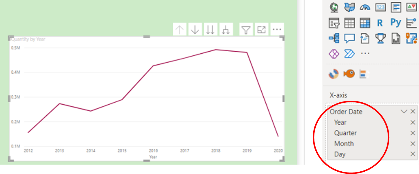
Firstly, you need to create a visual containing ‘hierarchical’ fields e.g., ‘Country’, ‘Segment’, ‘Salesperson’ in order to facilitate the drilling tools. In the following example, a line chart is used to show an ‘Order Date’ field by ‘Quantity’ where Power BI desktop will automatically support a Date Hierarchy (see below).
- Notice there are four ‘arrow’ buttons above the chart, each with a different function:

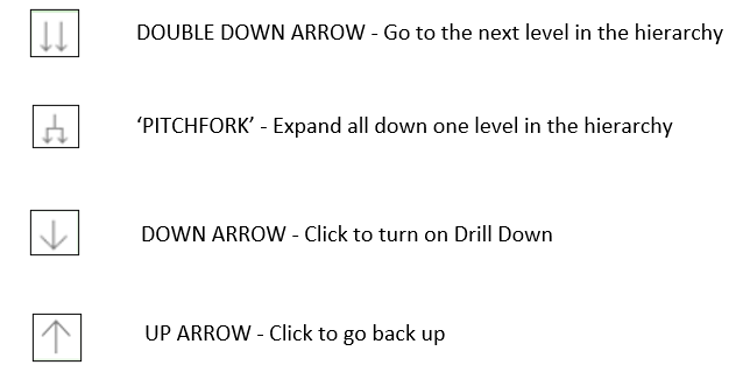
- Starting at the ‘top level’ i.e., ‘Quantity by Year’ click on

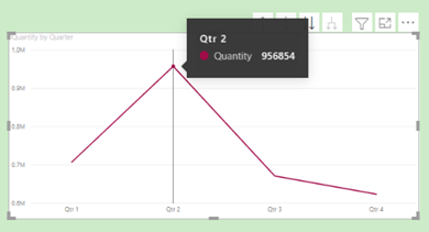
This action changes the line chart to show ‘Quantity by Quarter’ i.e., the next level down. for If you hover on the data point of Qtr. 2, it highlights the overall Quantity for Qtr. 2 over the entire 8-year period.
- Clicking on the
 button again brings up another view – i.e., ‘Quantity by Month’:
- Again, clicking on the
 button again brings up a daily view – i.e., ‘Quantity by Day’:
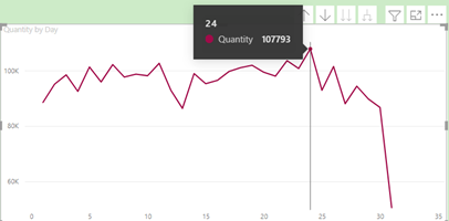
Note the tooltip showing that the day in which most quantities are sold in any month is the 24th.
- The ‘double down’ arrow is now faded out, which means this level is the lowest level of granularity
- Click on the button to go back through the hierarchical levels to the top level
- Now click on the ‘Pitchfork’ button
 to show the next expanded level:
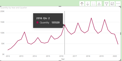
The tooltip is now showing all Quantities in Qtr. 2 of 2016.
- Click on the button again to show the chart at month level:
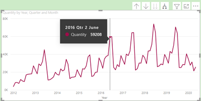
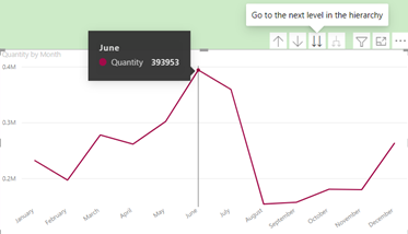
Now the tooltip is showing all Quantities in June Qtr. 2 of 2016. Let’s say you wanted to analyse the data further at day level in this particular month of June.
- Click on the ‘Drill Down’ arrow
 to turn it on showing the following:
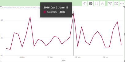
This now reveals that the highest performing day in terms of Quantity is the 18th.
Conclusion
So often in business, it is the details that can provide a competitive edge to improve performance. Having access to the various levels of data within a single visual using the Drill buttons will definitely help to achieve this goal. Exploit Power BI’s Drilling tools to enhance profitability in your company.
For course details on our Power BI Reporting course at STL, please click on the link below:
https://www.stl-training.co.uk/syl/355/power-bi-training-courses.html
For more information on Data analysis in business, please click below:
https://www.inc.com/carol-sankar/how-your-data-can-improve-your-customer-relationships.html