Let your Data tell the Story with Power BI

Tired of interrupting your PowerPoint presentation just so that you can show the live version of your report in Power BI? You can now create interactive PowerPoint presentations which connect live to your Power BI reports! This blog will show how you can let your data tell the story with Power BI.

Imagine that you are called on to present the new sales strategy for next year. In the presentation, you would like to present some statistics for the current year.

In the Power BI June 2022 version, there is a feature which can help you build engaging and dynamic PowerPoint presentations.

Say you want to show the audience statistics or other business intelligence information from your Power Bi reports during a meeting. No longer do you need to stop the PowerPoint presentation to open the Power BI report. You can simply integrate the Power BI report pages as slides in the presentation! The slide will display the live Power BI page. This means that all the interactivity from the Power BI page will work on the PowerPoint slide.

If your Power BI reports refresh live or when you manually refresh them, PowerPoint will also refresh during your meeting!

How does it work and how do you do it?

It is quite simple. You open your Power BI Service where you store your published reports. Here, you open the report containing the page you want to integrate in your PowerPoint presentation.

You can create a new PowerPoint presentation from your Power BI page, or you can add the Power BI page into an existing PowerPoint presentation.

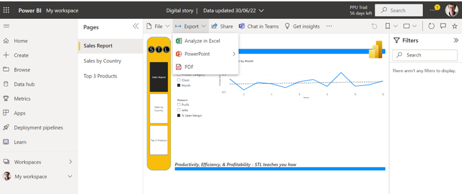
With the Power BI report open in Power BI Service, click Export, and click PowerPoint.

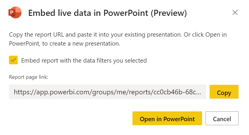
You now have two options.

  • You can copy the Report page link and paste it into a PowerPoint slide. If you do this and click on the link during a presentation, you will open your browser and open the report in Power BI service.
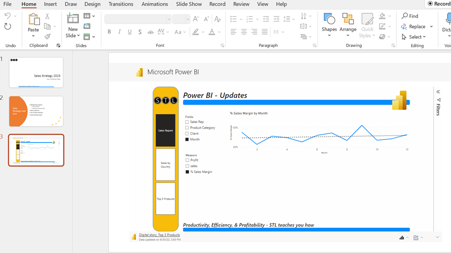
  • You can choose ‘Open in PowerPoint’. The PowerPoint application will open, and you will get a slide containing the live report page. Here you can use all the functionality from your Power BI report!

If you’ve added Page Navigation to the page, you can navigate through many Power BI report pages from one PowerPoint slide.

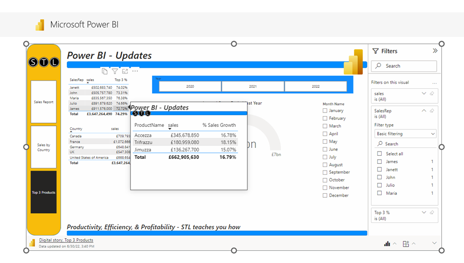
You can also sort and filter your report during the PowerPoint presentation. Moreover, if you have built custom tool tips, they will also pop up when you hover over the visuals in the report.

Your PowerPoint presentation will update if you change the report in Power BI desktop and publish the report to replace the old one. In other words, next time you need to use the PowerPoint presentation, all the changes you made will update in the PowerPoint presentation.

Conclusion

This is yet another good reason to choose Power BI for reporting and creating dashboards. You do not need to jump back and forth between the reports and the PowerPoint presentation. The presenter can access and show a lot of information from one single slide.

You do not need to update the PowerPoint presentation by creating new charts or slides to show current data or business intelligence.

This new Power BI tool can save time and make meeting preparations much more efficient. Let your Data tell the Story with Power BI.

STL runs four different Power BI courses and PowerPoint Introduction and PowerPoint Intermediate/Advanced courses.

Power BI – Create a Perfect Chart Visual

Power BI Desktop can work with a large number of visuals to make sure that the audience of your reports are best informed to make the right decisions. It is your responsibility to make sure that the data is presented a way, so the audience of the reports are given a clear picture of the data in an efficient, clear, and correct manner.

power

In this blog post you will see a suggested way of building a chart visual, which will show you through some of the new Power BI Desktop features.

Case study to work through

A company is selling products in Mexico and have predicted how many items they are going to sell next year. The company is working with a confidence level of 90% accuracy.

The report creator would like to visualise this as precisely as possible in a Power BI report.

Of course, a text box is important to explain the audience what they are looking at.

The line chart displays the measure predicted quantity by product categories and product names.

power bi

The text is almost identical in the text box and in the chart title.

You can create dynamic text boxes, which will change the text based on filters and much more. This ensures that the text displayed will give your audience a precise description of what they see in the visual.


Next step 90% confidence level for the accuracy of predictions

Under analytics you have many options, like adding a trend line, average line, percentile line etc. You also have the option to add error bars.

If you have calculated upper bound and lower bound for the error, you can add the measures to error bars, but in this case a percentage will be used to indicate a 90% confidence level.

By changing the type from By field to By percentage, the confidence level will now be displayed by bars.

The error bars below have been turned off and error band turned on. Many people find this a lot clearer. The error labels have been turned on as well.

In the example above error labels are not the best solution to display. The values are not visible for all data points. Some data labels are not visible if there is not enough space.

And if we add the data labels for the predicted measure.

If you want the audience to get precise and easily understandable information, then this will not be the best solution. You can also add a plot background image to the visual. This may look exciting, but your audience may find it too busy, and you leave your visual open to misinterpretation. Have a look at the example below!

power

Arguably the best solution would be:

Some people prefer to digest information in text form.  Other people prefer images. In these examples, you can see it’s possible to satisfy both camps. Some would like to get the information from looking at the chart. Some from the exact numbers from the matrix. The notes added to the page will explain exactly what the page shows.

Conclusion

You must know your audience very well to understand their needs and create a successful report. One would like to have the information one way; another has other wishes. We need to make sure that the report is clear, however we present it!

We need to consider a lot of variables. A useful tip: Involve the audience from the beginning of the development of the report. This way you will receive feedback early enough so that you do not have to re-do hours or even days of work!