Power BI Artificial Intelligence Visuals Part 1 – Q&A

Microsoft has created some very interesting AI (Artificial Intelligence) visuals for Power BI. Power BI offers four AI visuals – Q&A, Key Influencers, Decomposition Tree, and Smart Narrative. This article is Power BI Artificial Intelligence Visuals Part 1 – Q&A. It is the first in a series of 4 which will go through all four AI visuals.

Power BI Artificial Intelligence Visuals

AI visuals are very useful and all four can provide your report with insight information from your data model. Without these, you have to do DAX measures and create your own visuals.

The Q&A visual

You can use the Q&A visual to ask questions of your data model and convert the answer to other visuals.

In this example the data model is HR data, with information about the employees. The data model includes how many days of training each of the employees has done, days of sickness, holidays, and productivity. Yes, the employees’ productivity gets measured! There is also a satisfaction score. The employees fill in an engagement form each year in which they can give a score on several key points to measure engagement.

To use the Q&A visual, click Q&A on the Insert tab in the AI Visuals group. Power BI will add the Q&A visual to the report page and suggest questions you can ask.

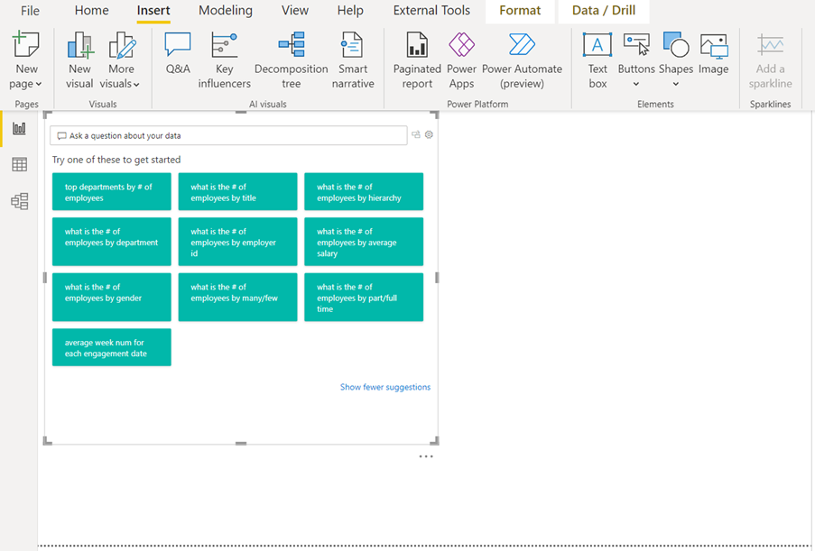
If you find a question on the list which is of interest for your report, you can simply click on the question.

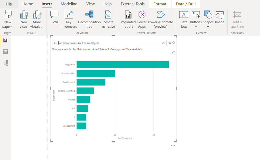
In the example below, we selected the suggested question “top departments by # of employees”. The Q&A visual shows the answer in a suggested visual.

If you want to display the answer in your report, you can convert the answer to a standard visual. To do this you will have to click on the icon just to the right of the question input box at the top of the Q&A visual.

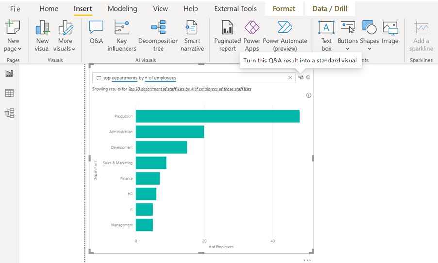
Then, Power BI will convert the Q&A visual to a standard visual If you do not like the suggested standard visual, you can of course change the visual to another standard visual.

Ask your own questions

If you want to ask your own question to your data model, you can just ignore Power BI’s suggested questions and type your own question in the question box.

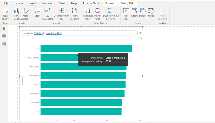
In the example below the question was “average #holidays by department 2018”. You can see the result below.

In the next example, the question was “average #days sick by department”. Here is the result.

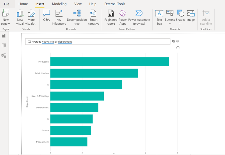
For Power BI to understand your own questions, you have to use the headers from your tables in the questions. In the example above, there is a table in the data model where the number of days of sickness are registered. The header of the specific column is “#days sick”.  In another table with the general information about the employees, there is a column in which the employee’s department is entered. The header for this specific column is “department”.

Conclusion

By using DAX measures, you can calculate similar results as in the examples. You can also create your own visuals, but the Q&A visual can do this without the need for manual input. It is also possible to create a list of your own suggested questions. When the report is then published, your audience can pick the questions they want answered from your suggested question list.

As mentioned at the beginning, this is Power BI Artificial Intelligence Visuals Part 1 – Q&A . If you want to know more about the other AI visuals in Power BI, please follow STL on LinkedIn or visit our website.

STL has two Power BI courses which include AI visuals: Power BI Reporting and Power BI Modelling, Visualisation and Publishing.


Automate reports with Power Query M Coding

This blog is for both Power BI and Excel users. In it, we demonstrate how you can automate reports with Power Query M coding

Automate reports with Power Query M Coding
What is Power Query?

The Power Query tool in Excel and the Query Editor in Power BI are identical. They are important tools for both applications. In Excel, many tasks can be automated. Excel users can then work much more efficiently and save a lot of time. This is because Power Query offers tools to structure, clean, and connect live to source data.

To take a query to a higher level of efficiency, a basic understanding of Power Query M (the coding language used in queries) will prove very useful.

How does a query work?

In this article, we will explain an example of date manipulation.

The query editor’s ability to connect live to external data sets is the most important feature of the tool. However, it is important that the query only connects to the data which creates the dashboard/report we need. We should remove all columns which are not needed for the output.

In the query below, a connection has been established to a data set with records going back to 2015. We only need to show the last 4 years of data in the report. To this view, we want the report to show the data starting from last day of the previous month, looking back 48 months.

This can be done manually by using a date filter, but then we must manually change the filter every month. We want to report to update by itself, and this can be achieved with Power Query M coding.

A query is like the macro recorder in Excel. When you perform steps in the query, it writes code. In Excel, the macro recorder writes VBA code, but a query writes Power Query M code. To see the code in the query, we have open the Advanced Editor, which is found on the View tab in the Query Editor.

In the Advanced Editor below, the code shows the only step done with the data so far. Four tables of data have been appended into one table.

Automating Reports with Power Query M

Best practice to keep the Power Query M code simple is to do as much as possible using the tools available in the query editor. Let the query write the code.

In the next example, we will initially set up the date range manually. Later, we will make it dynamicin the Advanced Editor by amending the code.

Each column in the Query Editor has a filter like the filters in Excel. For example, if we have a column with dates, we will have a date filter (see below).

Here, the Between option is used. The first criteria is after or equal to the start date. The second is before or equal to the end date.

Meanwhile in the Advanced Editor, the code for date filtering is now added.

A new line has been added to the code:

#”Filtered Rows” = Table.SelectRows(Source, each [SalesDate] >= #date(2018, 4, 1) and [SalesDate] <= #date(2022, 3, 31))

Now it is time to amend the code to make it dynamic. The Power Query M coding language is logical, however, we will need to change the fixed dates to dynamic dates. The logic here is similar to Date functions in Excel.

Step one

We will change the fixed year 2018 to a dynamic year.

We need to calculate the current year minus 4. The code Date.Year(DateTime.LocalNow())-4 will do the job. ‘Date.Year’ will extract the year part from a date and DateTime.LocalNow is the code to get current date (like the Today or Now function in Excel).

Step two

We will to change the fixed month to a dynamic month.

Date.Month(DateTime.LocalNow()) will do this. Date.Month will extract the month number from a date, and again Local.Now will get the current date.

We will not need to make the day number dynamic, since we always want the data to start from the first day of a month.

Now the start date is dynamic and the report we create will always start from the first day of the month, exactly 48 months back in time. After this, we need to make the end date dynamic.

The logic is the same as for the start date.

Below is the code the query editor wrote when we filtered the dates

#”Filtered Rows” = Table.SelectRows(Source, each [SalesDate] >= #date(2018, 4, 1) and [SalesDate] <= #date(2022, 3, 31))

We should change it to look like this:

#”Filtered Rows” = Table.SelectRows(Source, each [Date] >= #date(Date.Year(DateTime.LocalNow())-4, Date.Month(DateTime.LocalNow()), 1) and

[Date] <#date(Date.Year(DateTime.LocalNow()), Date.Month(DateTime.LocalNow()), 1))

The Result

An amazing thing will now happen to the report we created. Every time we get a new month’s data, the query will remove the oldest month. It will then drag in the previous month to our report so that it again shows the last 48 months.

Conclusion

It may require some knowledge and time to automate reports and dashboards in Power BI or Excel, but it is worth it. You will save double or triple the time you spend learning the techniques to create the reports.

If you want to learn how to automate reports with Power Query M coding, STL can help. We have an Excel Power Query course if you want to learn how to use the query editor in Excel. We also cover the query editor on our Power BI Modelling, Visualisation and Publishing course, if you are a Power BI user.