Maximise Data Performance with Data Modelling in Power BI

Today, I’m talking with Martin, one of STL‘s outstanding Power BI trainers, about the importance of Data Modelling. I’m asking Martin how I can maximise my data’s performance with data modelling in Power BI.

Maximise Data Performance with Data Modelling in Power BI

Hi Martin, thanks for taking the time to have a chat with me. My Power BI Reports often take ages to update when new data is added at source. I need to structure my data so that it takes up less memory and updates more quickly. I have a few questions for you:

What is a Data Model and why is it so useful?

Martin: A Data Model, in simple terms, is a system of datasets or tables with specific fields in common with each other. These are connected using something called ‘Relationships’. It is these relationships that help bring the disparate tables together as though they were a single entity. So why have a data model if you could just have one single file that contains all the data? The reason is that this single file (or flat file) uses up more memory and slows down performance because data is needlessly duplicated across multiple rows. However, a data model reduces the amount of duplication and will, in practice, help you become more productive.

That doesn’t sound too hard. How does it work?

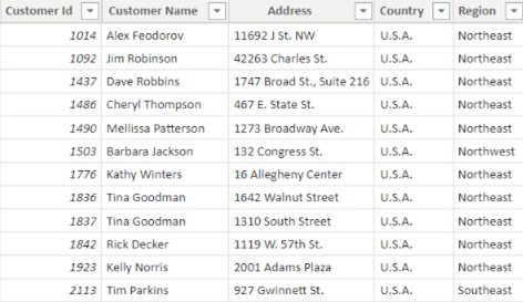
Martin: Let’s say you had Customer data relating to their contact and order details. In the table below is a ‘Customer’ table where Customer ID appears once. Each row contains a unique record of customer details.

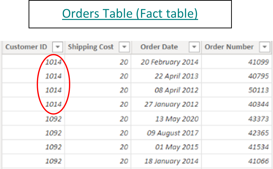
The 2nd table below contains many orders for each customer, so the Customer ID appears many times e.g., Customer ID 1014.

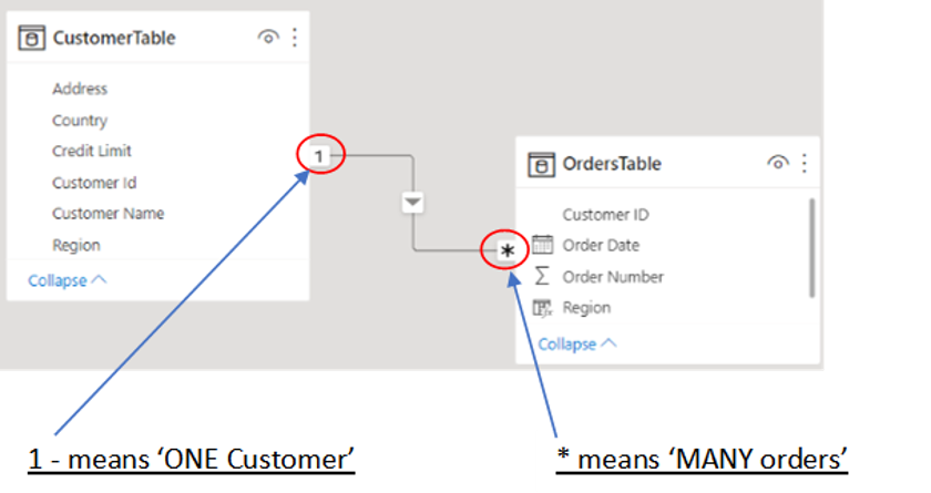
When these two tables are imported into Power BI desktop from Excel, the common field which is ‘Customer ID’ is used to create a ‘1 to Many’ relationship. This means that, for example, you can create a report visual to show a breakdown of Customer orders by Region even though the Order and Customer fields are in separate tables.

Without creating a data model, what is the alternative?

Martin: The standard practice would be to:

  1. Use the VLOOKUP formula in Excel to ‘look up’ each Customer ID in the Orders table
  2. Find a match in the Customers table
  3. Then return the corresponding ‘Region’ as a separate column back in the Orders table (see below)
  4. Once all the data is in a single table, create a pivot table to summarise ‘Orders per Region

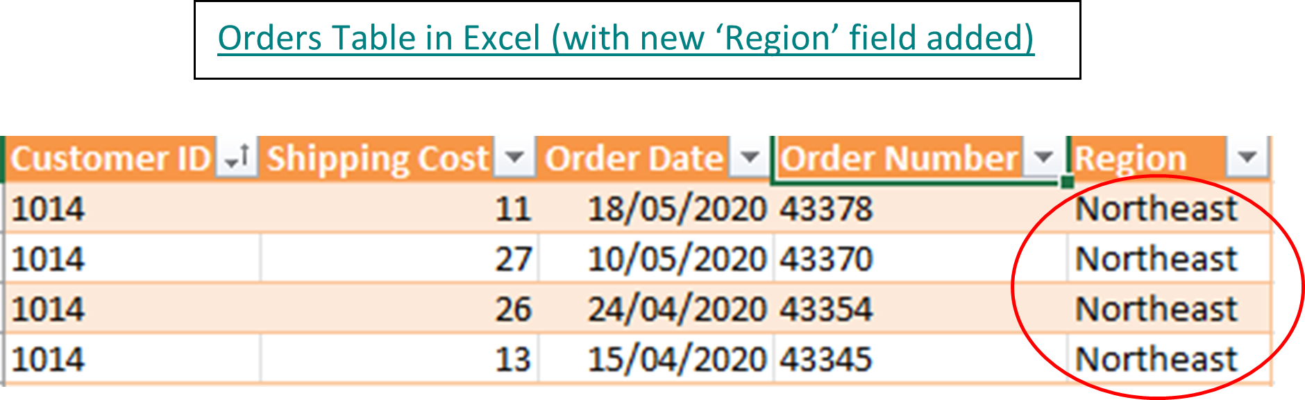
Note that ‘Northeast’ is duplicated 4 times. If each customer placed an average of 1000 orders and there were 100 customers, then the customers’ region would be repeated by a huge amount (100,000 times more). This inevitably slows down the performance and affects productivity. In contrast, the data model in Power BI Desktop would only refer to the ‘Regional data’ 100 times – once for each customer in the Customer table – and is therefore more efficient and quicker in processing the data.

Any final thoughts, Martin?

Martin: Using data models in your Power BI reports can dramatically reduce the amount of duplication and therefore help to maximise your data’s performance.

To learn more about Data Modelling and how to apply it to your data, STL runs a 2-day Power BI Modelling, Visualisation and Publishing course. Please click on the link below for the course outline:

https://www.stl-training.co.uk/syl/205/microsoft-business-intelligence-advanced-training-courses.html

To see how data modelling can be applied, please click the following article:

https://www.forbes.com/sites/anniebrown/2021/08/24/can-ai-data-modeling-prevent-climate-catastrophe/?sh=1cde32423baf

Thanks so much, Martin, for explaining how to maximise data performance with Data Modelling in Power BI. I will explore this some more and start creating my own data models from now on!

Power BI AI Visuals Part 3 – Decomposition Tree

Microsoft has created interesting and engaging AI (Artificial Intelligence) visuals for Power BI. The desktop app offers four AI visuals – Q&A, Key Influencers, Decomposition Tree, and Smart Narrative. This is Power BI AI Visuals Part 3 – Decomposition Tree, the third in a series which looks at all four AI visuals.

AI visuals are extremely useful. All four visuals can provide your report with insights and information from your data model, without which you will have to do DAX measures to create your own visuals.

Power BI AI Visuals Part 3 – Decomposition Tree

The Decomposition Tree visual

The Decomposition Tree visual in Power BI Desktop can let you visualize data across multiple tables and columns from your data model’s multiple dimensions. It automatically combines data and supports drilling down into multiple dimensions in any order. This tool is beneficial for ad hoc evaluation and managing root cause analysis.

In the example below, we used the Decomposition Tree visual to explore the employees’ productivity score. Productivity is measured frequently in the company, and we are using the visual to explain the score on many dimensions of the data model.

The Process

To create a decomposition tree visual, click Decomposition Tree on the Insert tab in the AI Visuals group. Then add the column you would like to investigate to the Analyse box for the visual. Here, you can drag the productivity score to the Analyse box and click on the down arrow in the box. This changes the calculation from Sum to Average.

Below you can see the start of the decomposition tree.

To investigate the score by department, we added the department column to the Explain By box. Have a look at the result of this action below.

Now the Decomposition Tree visual has broken down the average productivity score by department.

Below, we added the hierarchy dimension to the Explain By field. As you can see, it explains the productivity score by the department with the highest score. In this example, it is the finance department.

The audience can, however, interact with the graphic to investigate the other departments. To do this, simply click on a different department in the Decomposition Tree visual. Below, we selected the production department.

In the Decomposition Tree visual below, we are investigating the average number of sick days for the year 2019 (slicers can also filter the result in the Decomposition Tree visual). The result is broken down from highest to lowest score in an engagement survey this company does regularly to measure the employees’ job satisfaction. It may surprise you that employees with a high satisfaction score have a higher number of days of sickness.

The Decomposition Tree visual also shows the data broken down by Department and Hierarchy.

Conclusion

That concludes Power BI AI Visuals Part 3 – Decomposition Tree. This visual is a smart and efficient way to show and analyse multiple dimensions of your data model. You get in-depth knowledge from your data sets without having to use complex DAX measures.

This is part 3 of a series of four as mentioned at the top. If you would like to learn about the other AI visuals in Power BI, please follow STL on LinkedIn or visit our website.

STL has two Power BI courses which include AI visuals. Power BI Reporting and Power BI Modelling, Visualisation and Publishing.